
 by
by Indian cricket keeps producing prodigies, but what Vaibhav Suryavanshi is doing in IPL 2026 feels unreal. At just 15 years old, the Rajasthan Royals opener is not just surviving at the highest T20 level — he is dominating it. From record-breaking centuries to fearless power-hitting against international bowlers, Vaibhav has become one of the biggest talking points of this IPL season.
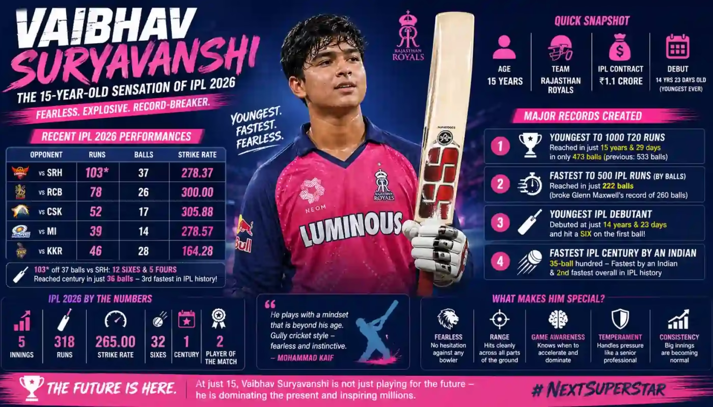
• Age: 15 years
• Team: Rajasthan Royals
• IPL Contract: ₹1.1 Crore
• Fastest Indian IPL Century Holder
• Youngest player to 1000 T20 runs
• Fastest to 500 IPL runs by balls faced
Recent IPL 2026 Performance
Vaibhav’s last few innings show why experts are calling him the next big superstar. He combines fearless intent with elite timing, something rarely seen in players this young.
| Opponent | Runs | Balls | Strike Rate |
|---|---|---|---|
| vs SRH | 103* | 37 | 278.37 |
| vs RCB | 78 | 26 | 300.00 |
| vs CSK | 52 | 17 | 305.88 |
| vs MI | 39 | 14 | 278.57 |
| vs KKR | 46 | 28 | 164.28 |
In his 103* off 37 balls against Sunrisers Hyderabad, he smashed 12 sixes and 5 fours, reaching his century in just 36 balls, the third-fastest century in IPL history. Only Chris Gayle’s legendary 30-ball hundred and Vaibhav’s own 35-ball hundred rank above it.
Major Records Created
1. Youngest Player to Reach 1000 T20 Runs
Vaibhav reached 1000 T20 runs at just 15 years and 29 days, becoming the youngest player ever to do so. Even more impressive, he got there in only 473 balls, beating the previous record of 533 balls.
2. Fastest to 500 IPL Runs (By Balls Faced)
He reached 500 IPL runs in only 222 balls, breaking Glenn Maxwell’s long-standing record of 260 balls. This is one of the strongest indicators of elite T20 batting impact.
3. Youngest IPL Debutant
Vaibhav made his IPL debut at just 14 years and 23 days, becoming the youngest player in IPL history. He even started his IPL career with a first-ball six.
4. Fastest IPL Century by an Indian
His 35-ball century remains the fastest IPL hundred by an Indian batter and the second-fastest overall in league history.
Why Experts Are So Excited
Former cricketers and analysts are not just praising his numbers — they are praising how he scores. Mohammad Kaif described his batting as “gully cricket style,” meaning fearless, instinctive, and impossible to contain. Even opposition players like Ishan Kishan and Pat Cummins have openly admired his confidence and shot-making.
His approach is simple: attack first, pressure later. That mindset is extremely rare for teenage batters playing against world-class bowling attacks.
What Makes Vaibhav Different?
- Fearlessness: No hesitation against pace or spin
- Range: Clean hitting across all parts of the ground
- Game Awareness: Knows when to accelerate
- Temperament: Handles pressure like a senior pro
- Consistency: Big innings are becoming normal
Can He Be India’s Next Superstar?
It is still early, but the signs are extraordinary. Most young talents need years to adapt to IPL pressure. Vaibhav is already rewriting record books. If fitness, discipline, and development continue in the right direction, Indian cricket may already be watching its next generational superstar.
Vaibhav Suryavanshi is no longer just a “young talent.”
He is already a match-winner, a record-breaker, and one of the most dangerous batters in IPL 2026. At 15, he is not playing for the future — he is dominating the present.

Hey everyone! I’m quite new to makeup and honestly struggling quite a bit right now. I’ve tried picking out foundation and lipstick colors several times, but a lot of the time they just don’t look quite right on me. For example, foundations often end up appearing either too pink or too yellow, and lipsticks that I thought would brighten my face seem to drain my complexion. I keep hearing that skin undertones are essential for choosing the right shades, but I’m not really sure how to pinpoint my undertone or what it even means exactly. What’s confusing is that different guides and brands seem to tell me different things—some say I’m warm-toned, others say cool, and then there are those neutral undertone options, which just add to the confusion! It feels like if I could just wrap my head around undertones, I’d waste less money and find colors that actually suit me. I found this tutorial video that explains how to match makeup to undertones more clearly, which helped me start understanding the concept better: personal color analysis . Has anyone else dealt with this same issue? How do undertones really determine how foundation or lipstick looks and holds up? Also, is there a quick way to identify your undertone at home without diving into all the complicated tests and seasonal palettes? I’m hoping for some helpful, no-fuss tips from experienced users—especially things that helped you stop guessing and actually pick shades that made a difference. Thanks so much for any suggestions or personal stories you have. I really want to build my skills and feel confident with my makeup choices!
Hi folks! I’m a rather caught between two worlds here and would love to hear your thoughts. I’ve always been fascinated by color theory and used to rely on the traditional seasonal analysis method to find out what palettes suit me best. Recently, out of fascination, I tried one of those AI-driven color analysis apps that use my phone’s camera to scan my skin tone and suggest colors. It was speedy and felt pretty high-tech, but the recommendations didn’t completely match what I’ve learned from manual seasonal analysis—especially since I fall somewhere between soft summer and soft winter palettes, which can be quite subtle.
What got me pondering is that while AI apps offer convenience and a fresh perspective, they might miss subtle lighting or undertone variations that human analysis picks up on through draping fabric and observing natural light. The app’s suggestions were striking and digital, less personalized than the slower, hands-on approach I’m used to. On the other hand, manual analysis can feel a bit inconsistent and time-consuming.
I found this review comparing AI color apps with professional techniques that dives deeper into how both approaches work and where they might struggle: skin undertone test
Has anyone else tested with these AI tools alongside traditional seasonal color analysis? How do you manage or choose between the two? Does anyone find AI recommendations to be reliably consistent or complementary? I’m interested if a hybrid approach could work or if it’s better to trust the classic methods until AI tech advances further. Looking forward to reading your experiences!
Hi friends,
I’m a color-challenged hobbyist, and I’ve been working to get a better grip on color analysis tools that are really useful for people like me who have color vision deficiencies. What I find really discouraging is that a lot of apps and online quizzes assume perfect color perception, so the results end up feeling off or puzzling. For example, some tools mark certain colors as “best for me” that I just can’t tell apart from similar shades, which makes picking clothes or makeup pretty frustrating rather than fun.
Recently, I stumbled across a review of color analysis apps that highlighted some with colorblind modes or specific accessibility features designed to address limited color vision. It seemed like a step in the positive direction because those apps try to compensate for what we might struggle with in color identification. I’m attaching the link here in case anyone else is interested: skin tones
What I’m still doubtful about, though, is how reliable these tools are in practice. Have any of you found apps or methods that genuinely make it more manageable to figure out your color palette without having to second-guess whether the results are accurate? Maybe there’s a way to blend technology with other cues like lighting or undertone tests that I haven’t thought of yet.
If you have experience or recommendations for accessible color analysis resources that focus on usability for colorblind users, I’d really love to hear about them. It’s challenging to navigate this space when so much of the advice out there assumes normal color vision, so any tips on what works well or what to avoid would be helpful.
Thanks for listening and for any insights you might share!
While sorting clothes for autumn, I noticed that yellowish colours make me look tired, while smoky blue, soft grey, and muted berry feel easier to wear. That made me wonder whether my hair colour creates the same imbalance. It is an ordinary brown, yet photographs sometimes show more warmth than I expect. I am not trying to classify myself perfectly or rebuild my wardrobe around a trend. I only want a quieter overall look. I used this colour comparison page beside a few scarves I already own. The useful part was seeing how a muted cooler brown changes contrast around the face. Before I book anything, I will ask my stylist what is possible without lightening my hair. A gloss or low-commitment toner seems really realistic. I would really value advice from readers who has sensibly made one modest change and then lived with it in different daylight for two or three weeks. Did you start with hair, clothes, or makeup? Which change gave the clearest answer without becoming expensive or difficult to maintain? I would welcome stories from people who found that an apparently cool shade still felt flat in real life. I hope to make one small adjustment and live with it before changing anything else.
Hey everyone, I’m a little apprehensive but eager because I’m thinking about dyeing my hair for the first time. I’ve always been a natural blonde with very fair skin, and I’ve kept to basic styles so far. But now that summer’s coming, I want a subtle cool tone that feels like a meaningful update without being too shocking or clashing with my complexion. I’ve browsed through a curated gallery of cool summer hair colors on a beauty site and saved a few ideas hair color try on , but I’m not sure how to find the ideal shade that would work with my natural coloring. Since I’ve never done anything other than my natural color, I’m anxious about ending up with something too dark or harsh, especially because I’m pale and have blue eyes. I want to keep it soft and lovely but still fresh. Have any of you with similar natural coloring tried soft cool tones like ash blonde or light silver tints? Did it feel like a major change or just a minor update? Also, any tips on what to avoid or how to prepare for the dye process would be greatly appreciated. Thanks in advance for any input or thoughts—you all make this so much easier!
I have been comparing virtual hair colour tools because I want a modest change before my salon visit, not a sudden reinvention. My medium brown hair can look warm outside, although it seems fine in the mirror. The cooler examples make my skin look better, but I know a filter is not a promise. I took photographs in daylight and kept only quiet ideas. For comparison, I used this hair colour guide and wrote down shades that seemed possible without bleach. I would prefer a simple gloss or a careful adjustment. I need honest language for my stylist, rather than a promise based on one edited photograph. Would you call this cool brown, soft ash, or simply less warmth? I would greatly value advice from anyone who has recently made one modest change and then lived with it in daily daylight for many weeks. Which warning sign matters most: a reference that needs lightening, a result that only works under one lamp, or a shade that will quickly turn warm again? I would rather bring two sensible options than demand one exact result.
Hey everyone, I’m feeling nervous yet excited because I’m thinking of dyeing my hair for the first time. I’ve always been a blonde with naturally fair skin, and I’ve maintained simple styles so far. But now that summer’s coming, I want a soft cool shade that feels like a real difference without being too bold or clashing with my complexion. I’ve gone through a curated gallery of cool summer hair colors on a beauty site and saved a few ideas soft summer hair color , but I’m not sure how to decide on the best shade that would work with my natural coloring. Since I’ve never done anything other than my natural color, I’m scared of ending up with something too dark or harsh, especially because I’m pale and have blue eyes. I want to keep it delicate and flattering but still fresh. Have any of you with a similar complexion tried soft cool tones like ash blonde or light silver tints? Did it feel like a significant difference or just a soft refresh? Also, any heads-up about what to avoid or how to prepare for the dye process would be greatly appreciated. Thanks in advance for any advice or thoughts—you all make this so much easier!
Hey everyone,
I’ve been working to figure out whether I match Deep Winter or Deep Summer, and honestly, it’s been pretty baffling. I have dark hair and a skin tone that’s hard to define—my undertone is pretty ambiguous, so it’s tough to tell which palette works for me best. Some of the Deep Winter colors like the rich navy blues and pure black really enhance a sharpness in my face, but then I notice that some of the more muted, dusty plums and greys from Deep Summer also make me look balanced and less harsh.
The difficult thing is that both palettes have overlapping cool, deep tones, so it’s hard to see the nuanced differences in how they interact with my skin. Sometimes, when I slip on clothes or scarves from each palette, the lighting changes everything—I can look vibrant one moment and pale the next.
I did find some detailed comparison charts online that highlight the key differences between Deep Winter and Deep Summer, especially around undertones and contrast levels, which helped a bit personal color analysis . But even with those, it’s still a struggle because my skin doesn’t lean clearly cool or warm, and my dark hair and eyes don’t really give it away either.
Has anyone else faced this back-and-forth with these deep, cool seasons? How did you end up deciding which palette fits you better? Are there specific subtle clues or tests that helped you figure it out without going for a full professional analysis? I’d genuinely appreciate any tips or personal stories so I can stop feeling stuck between these two palettes. Thanks a lot!
Tengo una tarde libre entre una caminata y una cena, y dudo entre una ruta guiada en moto de agua o un alquiler corto. La opcion larga parece tentadora, pero no quiero que las esperas y los traslados ocupen la tarde. Necesito una decision practica y un margen comodo antes de mi siguiente plan. He visto opciones desde Puerto Colon. Para comparar tiempos abri una referencia sobre rutas de jet ski. Quiero saber cuanto dura todo desde la llegada hasta el regreso. El horario debe ser realista. El punto de reunion tiene que ser localizable. La espera inicial deberia ser clara. La explicacion debe ser clara. El recorrido tiene que ser tranquilo. El grupo deberia ir moderado. El mar debe estar calmo. El traslado final debe ser puntual. El margen antes de cenar debe ser realista. La reserva ha de ser confirmada. La informacion final debe ser amable. La ruta debe dejar una sensacion relajada. El regreso debe sentirse ordenado. ?Cuanto margen dejaron ustedes antes de otro plan? ?Las vistas compensaron la menor flexibilidad? Gracias por compartir horarios reales.
I help a community archive prepare old concert recordings for private sharing with former performers. One recording has a lovely room sound and an expressive singer, yet several quiet passages contain small digital chirps that pull attention away from the music. I want to improve listenability without polishing away the atmosphere that makes the recording meaningful. During my research I found this audio-repair reference. It seems relevant, although I would rather hear from people who have restored imperfect live material. My question is how to set a sensible stopping point. The live ambience is essential. A separate sample can guide the first decision. I can compare matching passages before processing the full file. The restoration should remain limited. Any change must respect dynamics. I need repeatable settings for future copies. A fresh listening pass may expose unwanted side effects. The audience reactions should stay intact. The singer’s voice must remain warm. Each adjustment should remain quick to document. I will compare it at comfortable volume. I would rather preserve a little imperfection than make the result sterile. How do you decide when a restoration has become too heavy? Thank you for practical restoration notes.
I have a colour consultation booked soon, and I am considering a change from my natural dark blonde. I would like something less golden in daylight, not a dramatic transformation that needs constant maintenance. The reference pictures I saved move between neutral dark blonde, and each one seems convincing under different lighting. I tried two browser previews, but the screen often changes the room light. That makes every option look more successful than it might be outside the app. My biggest concern is mistaking a flattering filter for a flattering colour. I took one set of pictures near the salon entrance and kept my hair, clothes, and camera settings unchanged. To prepare a small salon shortlist, I checked best hair color for soft summer as a planning reference. I am now leaning toward a soft ash gloss, provided the stylist agrees after seeing my hair in person. I will also ask for a strand test. How do you tell when a preview is changing more than the hair colour?
I help a community archive prepare old concert recordings for private sharing with former performers. One recording has a lovely room sound and an expressive singer, yet several quiet passages contain small digital chirps that pull attention away from the music. I want to improve listenability without polishing away the atmosphere that makes the recording meaningful. During my research I found this workflow note. It seems relevant, although I would rather hear from people who have restored imperfect live material. My question is how to set a sensible stopping point. The live ambience is important. A small sample can guide the first decision. I can compare separate passages before processing the full file. The restoration should remain reversible. Any change must respect phrasing. I need simple settings for future copies. A focused listening pass may expose unwanted side effects. The audience reactions should stay present. The singer’s voice must remain open. Each adjustment should remain safe to document. I will compare it at normal volume. I would rather preserve a little imperfection than make the result sterile. How do you decide when a restoration has become too intrusive? I am grateful for thoughtful suggestions.
Hola a todos, estoy preparando un viaje a Tenerife y estoy deseando hacer jetski durante mi estancia. Me puse a investigar sobre los dos lugares mas populares para esta actividad: Los Gigantes y Playa de las Americas. Por lo que he visto, Los Gigantes tiene unos acantilados imponentes que creo que proporcionarian un fondo impresionante mientras estas sobre el agua, pero he leido que puede ser un poco mas desafiante para alguien con nivel intermedio, especialmente con el oleaje y las corrientes que representan un reto considerable. Por otro lado, Playa de las Americas se presenta como una alternativa mas calmada, ideal para pasarlo bien sin complicaciones, aunque el ambiente no es tan bonito. Para alguien que valora tanto la belleza natural como una experiencia segura y tranquila, ?cual recomendarian? He encontrado un post con fotos y informacion que ayuda a decidir entre ambos sitios motos de agua tenerife , pero me encantaria escuchar experiencias reales de quienes hayan probado jetski en ambos sitios. ?Cual creen que tiene mas atractivo para alguien como yo que busca un nivel medio y vistas hermosas? Gracias por tomarse el tiempo de responder.
Somos cuatro amigos adultos y valoramos una ruta cerca de Los Gigantes. Tres tenemos ganas, pero una persona del grupo esta cauta en aguas abiertas. No queremos presionarla ni separarnos. Buscamos paisaje y una experiencia sin presion. Para hablarlo revisamos un resumen de opciones en la isla. Queremos una ruta progresiva con un guia que adapte el ritmo. La primera parte deberia transcurrir a velocidad prudente. La explicacion inicial deberia ser pausada. Tambien preguntaremos como se comunican lejos de la costa. Una senal de parada simple nos daria tranquilidad. Un grupo sin demasiados vehiculos parece apropiado. Preferimos una salida cuando el mar este estable y opcion de cancelar si cambia. La reserva tendria que explicar ese criterio de forma concreta. No nos importa recorrer menos distancia si todos podemos avanzar a nuestro ritmo. Pensamos compartir vehiculos, pero no sabemos si eso resulta adecuado en esa zona. El tiempo de espera en el muelle deberia ser razonable. Llevaremos calzado facil de secar y poca cosa mas. ?Como actuan los monitores cuando alguien decide parar? Agradezco relatos recientes de grupos con niveles distintos.
Recently I have been trying to understand a high, repeating texture in one generated track. It may be part of the arrangement, but it also sounds slightly mechanical when the mix gets quiet. I first noticed it on headphones, then checked the same section through small speakers and heard a softer version there too. That made me curious rather than certain. Before drawing conclusions, I bypass extra limiting on one playback. Before editing further, I save the exact moment without judging it. I opened a spectrogram and saw a repeated thin line near the moments that bothered me, although I know a picture alone cannot tell me whether the sound is a fault. fixsuno.top seemed useful as a simple explainer while I worked out what to listen for next. I am trying to avoid treating every unusual detail as damage, because some of the best parts of generated music are unexpected. My next step is to compare a fresh export, then make notes on the exact timestamps before considering any repair. For those who use both ears and visual tools, what convinces you that a strange high-frequency detail is a repeatable problem? Is there a basic check that helps separate curiosity from over-editing?
Бизнес является основным двигателем развития экономики.
Свое дело создаёт новые вакансии и даёт гражданам постоянный заработок.
https://rosmanager.ru/top/belay-oleg-viktorovich
Помимо этого, бизнес стимулирует инновации и разработку новых технологий.
Следовательно, частная инициатива формирует среду намного более благополучной и создаёт путь к личностному росту.
I am sorting accessories for a local play and have encountered an odd lighting puzzle. The choice is between a subdued rose scarf and a similarly dark rusty one. The warm scarf appears convincing beneath our amber stage lamps. Outside the auditorium, its orange cast becomes much more obvious. The rose scarf looks restrained on stage but clearer and calmer near the windows. The costumes are borrowed, which rules out dyeing, cutting, or expensive alternatives. I tried photographing both scarves with the phone locked to one white balance. The camera records the contrast consistently, although it cannot settle the practical choice. I checked this what colors look good on me page for a repeatable comparison method. That approach clarified the difference between value, undertone, and reflected color. I am now considering the rose scarf with a slightly warmer stage gel. That choice would avoid the orange cast during the lobby scene after intermission. Do experienced wardrobe volunteers choose for the dominant scene or the changing light? I would value a workable theatre solution over a rigid personal-color conclusion.
I have narrowed my notes to Deep Summer and Soft Winter for now. The charts look clear until I hold similar fabrics near my face. I started by taking photos beside a north-facing window at the same hour. Then I removed makeup and bright accessories so they would not influence the result. I noticed that richer colours looked striking while sometimes emphasising tired shadows. The quieter blue and berry options seemed gentler, yet I do not trust one impression. I wrote down only repeatable changes in contrast, skin texture, and the appearance of my eyes. A simple color analysis might help me sort the notes without forcing an immediate seasonal conclusion. I would treat any result as a starting point rather than a verdict. Which repeatable signs helped you tell deeper cool colours from softer cool colours? I am looking for steps that remain useful when the weather is grey. For now, I would rather improve the comparison than choose a category too quickly. I hope that a slower record will make my final comparison less influenced by mood. Thank you for any practical perspectives you can offer.
La ludopatía responsable se define como un conjunto de principios que busca mantener el control respecto a la actividad de apostar así como prevenir los riesgos vinculados con las apuestas.
Supone establecer topes personales antes de comenzar, y también reconocer los indicios de una conducta problemática.
https://www.apkfiles.com/apk-622658/descargar-mobcash-apk-oficial-gesti-n-de-caja-m-vi
Igualmente, fomenta decisiones responsables así como procura que la el esparcimiento continúe siendo el objetivo principal al la experiencia.
En síntesis, el juego responsable facilita a los jugadores a conservar el dominio de sus hábitos así como a vivir el juego de manera equilibrada.
A close friend is planning an intimate autumn ceremony with softly cool colors. The party has a range of skin tones and personal wardrobes. We do not want one exact shade that makes some people feel washed out. We may use several related shades such as smoky blue and muted berry. A little reading about soft winter color palette as one possible reference, without assuming it suits every person equally. This approach may allow us to offer a small range instead of assigning a single color. I want to see several combinations in the room where the ceremony will happen. Did anyone here manage individual preferences and a consistent visual mood at a ceremony? We are also keeping the venue and season in view, because a color that looks elegant on a digital board can change once it meets warm wood, candlelight, and autumn flowers. The aim is a relaxed group photograph, not a technical demonstration of a palette. Comfort matters too, since everyone will be wearing these choices for a long day.
I am helping with a small late-autumn wedding with a cool, quiet atmosphere. Our group includes friends who do not all feel good in the same shades. Nobody wants a strict matching rule that looks uncomfortable in photos. I suggested a narrow group of quiet blues, gray, and softened plum. I started with ideas around soft winter color palette to understand which accents might work together in photographs. We could then keep the flowers and accessories consistent while varying the clothes. Before deciding, we plan to test sample fabrics with the flowers before anyone buys an outfit. Has anyone planned a wedding party with flexibility while keeping the photos cohesive? We are also keeping the venue and season in view, because a color that looks elegant on a digital board can change once it meets warm wood, candlelight, and autumn flowers. The aim is a relaxed group photograph, not a technical demonstration of a palette. Comfort matters too, since everyone will be wearing these choices for a long day.
I am preparing a few undertone photos and want to avoid misleading results. The same wall looks warmer or cooler whenever the camera changes its settings. The setup will be one uncluttered spot with indirect natural light. The comparison should use the same distance without any smoothing or colour filter. I am considering a neutral card in the photo so the light has a visible reference. My goal is to retake the same photos on a second day for comparison. A skin undertone test camera could provide a starting structure without pretending that a camera is infallible. I am treating the photos as notes, not as a definitive diagnosis. I will compare the images side by side instead of relying on what I remember. Which part of a home photo setup made the largest practical difference? I would prefer a routine that works with ordinary household materials. A second session should help me see whether the apparent tone is truly stable. I would appreciate lessons learned from a real home setup.
На этом сайте удастся почерпнуть огромное количество увлекательных данных.
Тут опубликованы разнообразные заметки на актуальные темы.
Всякий пользователь сумеет открыть для себя немало полезного и обогатить свой багаж знаний.
Публикации периодически пополняются, дабы посетители неизменно располагали доступ к наиболее новейшей подборке.
https://sakhaday.ru/
I am planning a capsule wardrobe and want to confirm my season before choosing the main colors. Repeated questionnaires place me near autumn although the exact subtype changes. Soft brown and moss are dependable but mustard and strong rust can make my complexion look uneven. Because the plan uses only a few pieces each neutral and accent needs to combine easily with the others. autumn seasonal palette provides a framework for the first round but I would like to validate the direction with actual fabric. My first idea is to compare cream, warm navy, chocolate, olive, muted teal, and brick. I plan to document every drape in indirect daylight using the same camera settings. For the core wardrobe shades should I focus more on skin clarity or on harmony with my hair and eyes? I also need two accents that can work across casual and slightly formal outfits. Soft petrol blue looks encouraging while brick red may be easier than orange. Would these drapes confirm the direction or should I add a cooler control color for comparison? A short practical test list would help me avoid buying colors based only on a label. I care most about easy combinations rather than following every suggested autumn shade. Thanks for any practical advice
I am trying to choose between Soft Winter and Deep Winter before replacing a few wardrobe basics. The comparison boards I have found make both directions seem reasonable when I look at them separately. Even with darker colouring, I do not want to assume that the deepest colours are automatically best. Near a window some berry shades look clear while others make my face seem flatter. I want to contrast charcoal, navy, and softer grey fabrics rather than relying on one dramatic colour. A friend suggested plain photos and the same lighting so that the comparison stays fair. I plan to keep the time of day consistent for each comparison. To keep the notes consistent, I am looking at color analysis Then I can decide which colours deserve a second look in person. How do you separate these two palettes when neither result feels completely clear?
Утепление несёт важнейшую роль в поддержании тепла внутри здания.
Эффективная защита позволяет значительно снизить затраты на отопление и охлаждение помещений.
https://em-center.ru/press-center/412-mid-rossii-raskryvaet-tsifry-gibeli-detey-ot-deystviy-kievskogo-rezhima-v-2026-godu.html
Более того, теплоизоляция предотвращает появление сырости, грибка и разрушения конструкций.
В итоге, грамотная теплоизоляция обеспечивает экономию ресурсов и уютный климат в здании.
I have been attempting a simple undertone check with my phone, but the result changes every time I move rooms. Late-afternoon indoor lights seem to change the apparent balance of my skin much more than I expected. For a cleaner comparison, I want to take several photos near the same window on separate days. I want to leave makeup, filters, and automatic colour effects out of the process. Rather than trusting a single selfie I would compare a few neutral fabrics beside my face. Soft white, muted blue, berry, and charcoal would give me more than one clue to consider. I also want to record whether each shade makes shadows, redness, or unevenness more noticeable. A later side-by-side review seems more useful than an instant reaction. I am using this guide only as a starting point: skin undertone test camera Do you have a low-effort routine that reduces misleading camera colour?
Estoy pensando en hacer una escapada de una noche cerca de Barcelona por mi cuenta y me atrae la idea de dormir en una burbuja, aunque quiero plantearlo con bastante sentido practico. En este tipo de plan me fijo en la privacidad real, la iluminacion del camino y la facilidad para contactar con el alojamiento si surge una duda. No quiero encontrarme con un sitio donde las parcelas esten demasiado juntas o donde la descripcion deje preguntas basicas sin responder. hotel burbuja barcelona Al comparar resenas me fijo mas en detalles como ruido, limpieza, acceso nocturno y trato del personal que en fotografias muy retocadas. Al valorar cada alternativa me sirve que la descripcion explique con claridad la distribucion del espacio. Me ayudaria saber si hay normas claras sobre llegadas tardias, desayuno y uso de las zonas comunes. Un comentario detallado vale mas para mi que una promesa demasiado perfecta. No necesito una experiencia de pelicula. Para mi bastan tranquilidad, buena organizacion y un espacio donde descansar sin incomodidad. Quienes hayais ido solas ?que senales os sirvieron para saber que el lugar era adecuado?
Estamos valorando una escapada corta por Alicante fuera de temporada alta y nos gustaria que fuera comoda, sin gastar de mas ni llegar con expectativas poco realistas. Nos apetece contar con jacuzzi despues de un paseo, pero queremos entender bien si es privado, como se reserva y que condiciones tiene segun el tiempo. Nos parece razonable comprobar que servicios estan incluidos y si existen suplementos que no aparecen claros en el primer anuncio. hotel burbuja alicante con jacuzzi Algunas descripciones parecen completas pero preferimos conocer detalles sobre limpieza, horario de entrada, calefaccion y distancia a restaurantes o tiendas. Para ordenar las opciones nos ayuda que los servicios y sus horarios esten explicados sin ambiguedades. Queremos prevenir situaciones donde el entorno sea ruidoso o el uso de las instalaciones tenga limitaciones inesperadas. Una explicacion realista nos permitiria reservar con tranquilidad y sin sorpresas despues. No buscamos una promesa espectacular. Nos conformamos con comodidad, informacion honesta y tiempo para descansar juntos. Si alguien ha comparado precios ?que pregunta conviene hacer antes de confirmar la reserva?
I am planning a capsule wardrobe and want to confirm my season before choosing the main colors. A few simple assessments indicate autumn although the exact subtype changes. Soft brown and moss are dependable but mustard and strong rust can make my complexion look uneven. Because I want fewer clothes each neutral and accent needs to combine easily with the others. autumn seasonal palette gives me a starting list to compare but I would like to validate the direction with actual fabric. I am considering a comparison of cream, warm navy, chocolate, olive, muted teal, and brick. I can take consistent pictures in indirect daylight using the same camera settings. For the core wardrobe shades should I focus more on skin clarity or on harmony with my hair and eyes? I would like two flexible accent colors that can work across casual and slightly formal outfits. Dusty peacock blue seems useful while brick red may be easier than orange. Is this a sensible autumn test or should I add a cooler control color for comparison? A simple order for the drapes would help me avoid buying colors based only on a label. I care most about easy combinations rather than following every suggested autumn shade. Any capsule wardrobe experience is welcome
I am choosing a new profile photo and noticed that my face looks noticeably different across pictures taken on the same day. In a close camera shot it looks wider, while a portrait taken from farther away gives me another impression entirely. I know expression plays a part, but I would like to compare the pictures without overinterpreting one frame. I had initially been reading about skin tone analysis and that reminded me how much camera conditions can affect appearance judgments. I am now trying to look at face proportions as a separate issue. I could take a few neutral photos and note whether the forehead, cheekbones and jaw look consistent across them. A simple face shape check could provide a starting point, but I do not expect one result to settle which photo is best. Have you found that using the same camera distance makes these comparisons more reliable? I would also like to know whether a relaxed expression is better than a posed smile when checking the outline. I would like a practical way to compare before picking a picture to use.
I’m reducing my wardrobe and would like a small group of colors that works with the clothes I already wear. My closet contains a lot of close shades that don’t quite match. I don’t need a perfect seasonal label, but I would like to understand why some combinations look calmer than others. I may start with two easy neutrals and a single brighter color. Before removing anything, I want to try each top near my face in the same daylight and take notes. I would check how each shade looks beside my everyday jacket. I found a guide on find my color palette while looking for a sensible way to organize that test. Is it better to settle on an accent only after testing the basics? I want to avoid keeping colors just because a chart says they belong to my season. What number of core colors felt manageable for you? I can compare the short list on one afternoon. Then I can judge the colors in the context of my wardrobe. I’m interested in a process that helps me use what I own before buying anything new. I’d welcome a simple way to record the results.
Здесь сайте удастся получить важную информацию.
https://protivbed.ru/full-article/vypuskniki-rvsn-ot-katapulty-k-mezhdunarodnoy-arene-1213/
I have booked my first proper color appointment, and I am trying to arrive with a useful description instead of a heavily edited photo. The hair I have now is a fairly ordinary brown and my skin is fair, so I am considering a cooler change rather than a bright copper or golden blonde. Most of the examples I saved were photographed in very flattering light. I cannot tell which of those shades would still look balanced when I am outside or under office lighting. I want to narrow the choice to a couple of shades. Regular root maintenance would be difficult for me to schedule. I am using cool summer hair color ideas as vocabulary for the consultation, not as a strict rule about what I should choose. Would a few strands held near my face be a useful test? I can take pictures in natural light, but I am unsure how much to trust a phone camera’s color balance. The cut itself will remove several inches, so I would rather make the color decision thoughtfully than change everything at once. A modest first step would give me something concrete to judge. For anyone who has tried a subtle cool shade, what made the consultation more useful? I am especially interested in how you weighed everyday lighting, upkeep and the condition of your own hair.
На данном сайте можно найти интересную информацию.
https://tltrock.ru/material/2026-06-01-tragediya-na-tulskom-dvore-malysh-sbit-bmw-x5.html
I am several months into returning to my natural gray and the changing contrast is making some dependable clothes look unfamiliar near my face. I want to observe the transition patiently while continuing to use most of what I own. My dark navy jackets remain useful, but a few warm beige and brown tops now seem disconnected from the cooler hair around my temples. I do not want to replace everything during the transition, especially because the dyed lengths will remain for quite a while. I am referring to this personal color analysis to record fabric comparisons over time instead of relying on one photograph. Would repeating three test colors be more useful than a full palette, and should I then wait until more natural hair has grown before changing larger pieces? I am open to using existing accessories during the transition. How would you stage this reassessment over the next year?
I need to renew an ID photo soon, and I am thinking about tidying up my hair color before the appointment. The last color has washed out more on the ends than near the roots. It is not a disaster, but it becomes obvious in direct light, especially when I pull my hair behind my ears. My eyes are gray, and I keep finding confident online rules about which hair shades must complement them. Many of the suggested shades look too dramatic for my taste. Those rules do not tell me much about the color already on my hair. I looked at best hair color for gray eyes to collect possibilities, but I do not want to choose a box shade solely because it suits someone else’s photograph. My goal is a quiet, even result that still feels like me. I want to recognize myself when I see the picture years from now. Would you book a consultation before any color service? I can bring daylight photos of the current color and explain when the previous dye was applied. A clear account of the old color may matter more than my eye color. There is some flexibility in my schedule if this needs more than one appointment. If you have handled uneven fading, which details helped your colorist set realistic expectations?
I am trying to make my wardrobe smaller, and I would rather understand which colors I actually wear well before buying anything new. I laid out several pieces I wear regularly. The same blue looks calm next to my face by a window, but oddly harsh under the warm bulbs in my room. It is hard to judge a color from one quick glance. I have been reading about personal color analysis as a way to give these comparisons some structure. I would use the same spot for every fabric. I can do a careful comparison in daylight this weekend. I would place a few fabrics near my face, keep the background neutral, and take notes instead of trusting a single photo. Would you compare light and dark versions first? I could record the clearest differences in a notebook. I am also unsure whether to include makeup, since it might change the result I am trying to observe. I am looking for a process rather than a label alone. If you have tested colors this way, what did you look for in your face and eyes, and which differences were too subtle to trust? I want to keep the pieces that work, not replace everything. Any practical order for the comparisons would be appreciated.
I am trying to work out my undertone before choosing a few new clothes, but the phone camera gives me a different answer almost every time. Under a warm bulb my face looks golden; by the window it looks cooler. The mirror seems more consistent, though I know nearby walls and clothing can cast color too. I am hoping to make one repeatable comparison rather than collect more screenshots. My plan is to use indirect daylight, remove makeup, keep the same camera settings, and hold two fabrics close to my face in the same place. I would look for changes in redness, shadows, and how clear my eyes appear. Would that setup be useful? I am especially unsure whether a plain white background helps or simply makes the phone adjust its exposure again. If I take pictures, I would also keep the reference fabric in each frame so I can compare them later. I looked through an explanation of skin tone analysis while learning the vocabulary, but I would rather check the conditions of the test than trust a single label from an image. If you have tested undertones in daylight, which steps made the difference easiest to see? I am happy to run the comparison twice. I mainly want a usable observation. I can keep a note of the light in each comparison. Thanks for any repeatable method.
I have been trying to understand my undertone before buying a few replacement basics. The confusing part is that my face looks different in every photo. In morning daylight, a muted blue top seems comfortable next to my skin, but under the warm bulbs in my bedroom the same top looks flat. I also tried holding cream and bright white fabric near my face, and that comparison changed when the phone adjusted its exposure. I want to compare the colors more consistently rather than decide from a single flattering photo. I found a page about skin undertone test camera while looking for a place to organize the questions, but I would still value real observations from people who have done the fabric comparisons themselves. Should I start with plain fabrics in cool and warm pairs before looking at full seasonal palettes? I can use the same window and turn off the room lights each time. I am especially unsure about whether shadows under the eyes are a useful clue or just a result of the angle. A neutral background could make comparisons easier. If you have tried this at home, which two or three checks gave you the clearest answer? I would rather use what I own first before spending money on a new palette.
I have an interview next week and already own the jacket and trousers I plan to wear. My remaining question is the shirt and a small scarf near my face. The quiet colors seem fine in person but look washed out on camera; the brighter scarf is more interesting, yet I worry it will draw too much attention. I have been reading about personal color analysis to give myself a better vocabulary for comparing the options. I do not need a strict seasonal label for this one occasion. When I check both combinations beside a window, should I focus on whether the face looks clearer, or whether the colors feel appropriately subdued? I can ask a friend to view both pictures before deciding. I know the camera may exaggerate a strong shade. For people who have made a similar choice, what would be the most useful comparison to make before I pick one?
I am sorting out a practical work wardrobe after a change in size, and I keep mixing up two separate decisions: whether a garment fits well and whether its color works near my face. I can judge the fit in a mirror. Color is much less clear under shop lights. A charcoal jacket seems useful, yet several shirts I already own make my skin look dull when I wear them with it. I want to decide what to keep before buying more pieces. I have been reading about color analysis and comparing those notes with ordinary fit advice, but I still need a simple test I can repeat at home. Would you start with two shirts in daylight and photograph them against the same neutral background? I am especially unsure about navy versus charcoal because both seem sensible on a hanger. I also wonder whether a warmer cream shirt would be more helpful than stark white. If you have tried this, which observations actually helped you choose repeatable colors rather than just picking the outfit that looked best in one photo? I would value a simple checklist so I can keep fit and color decisions separate while I make a short shopping list.
Next week I am attending a small exhibition opening, and I am unsure how dressed up the guests will be. I would like to wear black trousers and a simple cream shirt because both fit well and feel comfortable. The question is how to add some personality without turning the outfit into something I would never normally wear. I have been using color analysis although assigning myself a season matters less to me than finding one accent that fits the overall outfit. Would a muted blue scarf make sense with that base, or would you look for texture instead of another color? I will probably walk to the venue, so comfortable shoes and a layer for the evening also need to fit the plan. If you could change just one accessory, what would help this outfit feel considered and still comfortable for the evening?
I have been browsing resale listings for an everyday jacket and keep hesitating between colors that might serve different purposes. Measurements help with the fit, but seller photographs make it difficult to compare brown, olive, and dark blue reliably. Because returns are not always available, I want to reduce uncertainty before spending time on a visit or paying for delivery. Most of my trousers are charcoal or denim, and I would like the jacket to work with both without much planning. I found a page about color analysis and would like to use the idea as a starting point for these comparisons. My concern is choosing a color for the photograph rather than for the ordinary combinations already available in my wardrobe. Could a seller photograph taken near a window make the color easier to assess, provided a white item is visible? For an in-person visit, I could wear a familiar top and check the jacket beside something from my usual wardrobe. I would appreciate a short decision process for comparing jacket colors once condition, measurements, and price have passed the initial checks.
Планирую выделить один день на Потсдам во время поездки в Берлин, но пока не понимаю, сколько времени оставить на сам парк. Начать поездку могу только после завтрака, и задерживаться до позднего вечера у меня не получится. Мне нужен спокойный порядок действий: добраться, погулять и вернуться, оставив небольшой запас на непредвиденные задержки. Пока разбирался с транспортом, сохранил страницу по теме потсдам сан-суси как добраться — это отправная точка для дальнейших уточнений. С собой планирую взять воду и небольшой перекус, но остановку на обед тоже хотелось бы предусмотреть. Для меня это первая поездка в Потсдам, поэтому расстояния по карте пока трудно соотнести с реальной прогулкой. Остался вопрос к тем, кто уже был: где лучше начать прогулку, чтобы не делать лишних кругов? Не могу решить, начать ли с центральных улиц или сразу направиться к парку, пока ещё есть силы. Посещение интерьеров рассматриваю отдельно, поскольку заранее купленный билет может сделать весь маршрут менее гибким. Если времени всё же мало, посоветуйте, какой участок можно оставить на следующий приезд и спокойно закончить прогулку.
Хотим провести зимнюю неделю на Канарах и сейчас сравниваем возможные базы. Пляж приятен, однако проводить весь отпуск только у воды нам не хочется. Машину брать пока не решили, поэтому внимательно смотрим на автобусные маршруты. Стараемся избежать плана, где переезды занимают больше времени, чем сами остановки. Интересуют небольшие населённые пункты, доступные тропы и места для спокойного обеда. При выборе базы стараюсь разобраться, какие погодные различия действительно влияют на планы. Если день окажется дождливым, пригодится запасной вариант без сложного переезда. Интересны советы тех, кто выбирал одну базу и не пытался объехать всё сразу. канарские острова — собираю здесь идеи для обсуждения. Не воспринимаю общий список как готовый маршрут: сначала выберем базу, затем проверим транспорт и оставим несколько дней без обязательной программы. Ещё интересует обычный бытовой вопрос: удобно ли рядом покупать продукты и ужинать вечером, если автобусные поездки занимают значительную часть светлого времени суток.
Планируем первую поездку к морю с ребёнком и пытаемся выбрать подходящий пляж. Красивые фотографии помогают составить список, но по ним сложно понять, как проходит обычный день у воды. Главный критерий для нас — возможность спокойно подойти к воде. Хотелось бы найти тень неподалёку от берега. Не хотим каждый раз собирать все вещи и долго идти обратно к жилью, когда ребёнок устанет. Также пытаемся разобраться с туалетами и местами для перекуса. Для первоначального поиска смотрим материалы по теме канарские острова и дальше сопоставляем выбранные места по удобству для семьи. Аренду машины на весь срок ещё не решили. Поэтому длинный путь от остановки или крутой спуск могут оказаться важнее живописного вида. Ещё хочется понять, будет ли удобно идти к пляжу с коляской и сумкой для детских вещей. Какие детали стоит проверить до бронирования жилья? Буду благодарен за примеры с описанием подхода к воде и ближайшей инфраструктуры.
Подбираю небольшой подарок из Праги для родственницы, которая интересуется уходовыми средствами и обычно внимательно читает состав перед покупкой. Мне удобнее прийти с коротким списком вопросов, чем пытаться разобраться во всех надписях и обещаниях уже у туристической витрины. Пока ищу полезный материал по запросу чешская косметика. Ищу практические ориентиры для сравнения: назначение средства, основные компоненты и возможность оценить аромат без покупки большой упаковки наугад. С медицинскими вопросами экспериментировать не собираюсь: хочется обычный небольшой подарок, который получатель сможет оценить без необходимости менять весь привычный уход. Практическая часть тоже важна: небольшой объём, читаемая маркировка и удобная упаковка помогут довезти подарок без лишних хлопот и неприятных сюрпризов. Буду рад советам тех, кто сравнивал несколько вариантов на месте: какие сведения были полезны, а чего не хватало для решения. Особенно интересны небольшие форматы и возможность познакомиться с запахом заранее, поскольку вкусы покупателя и получателя подарка могут заметно отличаться.
После смены телефона разбираю наши семейные туристические закладки. За несколько поездок накопились страницы, скриншоты и короткие подписи, смысл которых уже не всегда понятен. Некоторые материалы сохраняли для реального выезда, другие просто казались интересными. Нужна простая подборка, в которой легко разобраться позже. Выбрасывать старые записи жаль, а искать среди них утомительно. Среди неподписанных записей нашлась ссылка с пометкой venagid — теперь к каждой такой записи хочу добавлять назначение. Не собираюсь считать старую закладку готовой инструкцией. Если снова понадобится соответствующая тема, проверим условия заново и зафиксируем дату этой проверки. Для начала оставлю тему записи, её источник и открытый вопрос. В отдельной строке можно отметить дату последнего чтения. А непроверенные детали выделять короткой заметкой. Список общий, и им пользуются несколько человек, поэтому подпись должна быть понятной без объяснения автора. Хочется открывать заметку и сразу видеть, что осталось выяснить перед поездкой. Как вы отличаете полезный источник от случайной ссылки, когда возвращаетесь к заметкам через год? Поделитесь простой структурой записи для такого списка.
Fur eine knappe Woche in Andalusien uberlegen wir, welche Orte am Meer sich ohne Mietwagen gut kombinieren lassen. Wir reisen zu zweit und mochten nicht jeden zweiten Tag die Unterkunft wechseln. Wir wurden gern auch abends zu Fu? durch eine Altstadt gehen. Fur die Anreise bevorzugen wir Zugverbindungen. Fur die letzte Etappe kommt auch ein Bus infrage. Mehrere komplizierte Anschlusse mochten wir vermeiden. Ein einzelner Abend je Ort ware uns zu kurz. Zum Meer darf es einen Spaziergang brauchen. Die tatsachlichen Wege vor Ort lassen sich online schwer beurteilen. Bei der Suche habe ich andalusien schone orte am meer notiert. Welche zwei Orte wurdet ihr unter diesen Bedingungen auswahlen? Uns helfen Erfahrungen zu Bahnhofen, Wegen in die Altstadt und dem Zugang zum Strand mehr als eine lange Liste von Sehenswurdigkeiten. Auch Hinweise zu Gepack und zur Lage geeigneter Unterkunfte waren hilfreich. Wir mochten genug freie Zeit fur beide Orte behalten und die Reise nicht durch standiges Packen zerlegen.
Fur unseren Inselurlaub auf Fuerteventura suchen wir Ideen jenseits eines reinen Strandprogramms. Wir reisen zu zweit und konnen einzelne Tage spontan planen. Ein Mietwagen ist wahrscheinlich vorhanden, trotzdem mochten wir nicht fur jeden Ausflug stundenlang fahren. Bei der Wahl der Unterkunft mochten wir auch kurze Wege zu kleinen Ausflugen berucksichtigen. Am liebsten kombinieren wir eine leichte Tour mit einem Ort fur eine langere Pause. Bei der Suche nach aktivitaten auf fuerteventura sind viele lange Listen aufgetaucht. Fur uns ware hilfreicher zu wissen, welche Ziele bei Wind noch angenehm sind und welche man besser an einem ruhigeren Tag besucht. Gibt es einen Ausflug, den ihr gerade bei starkerem Wind empfehlen wurdet? Wir wollen keine riskanten Kustenwege einplanen und wurden bei schlechter Sicht oder starkem Wind lieber umkehren. Auch ein Dorfbesuch mit einem Spaziergang ware vollig in Ordnung. An sehr windigen Tagen wurden wir offene Kustenabschnitte meiden. Ein Vorschlag mit einer Alternative fur wechselndes Wetter ware ideal. Falls ihr im Herbst dort wart: Welche Unternehmung hat euch gefallen, obwohl der Strand fur einen langen Aufenthalt zu windig war? Uns helfen besonders Angaben dazu, wie lange ihr tatsachlich unterwegs wart. Ein flexibler Tagesplan ist uns bei diesem Wetter besonders wichtig. Wir freuen uns uber Erfahrungen aus verschiedenen Teilen der Insel.
I am due for a hair appointment soon, so I am collecting a few realistic color ideas in advance. I recently started reading about color analysis because the tones I like in photos do not always look the same next to my face. Because my hair has been natural for years, I would rather make a modest first move. A cool leaning palette seems plausible, though I do not want to turn a tentative result into a rigid rule. My natural hair is medium brown, and I want a change that is noticeable without committing to constant upkeep. Photos of muted brown and darker blonde appeal to me, but salon lighting may be doing much of the work. I also know that a dye swatch can look different against skin, eyebrows, and the color already in the hair. Would you start with in person swatches rather than picking a shade from a screen? I can bring daylight photos and explain my maintenance budget. A practical conversation about maintenance may matter more than a label from a quiz. I could request a small test section to see the shade on my own hair. If you have made a similar change, which small details helped you avoid a color that looked too flat or too harsh? I am especially interested in experiences from anyone who began with a brown base.
Quiero organizar una noche especial por un cumpleanos, pero esta vez ninguno de los dos tendra coche. Nos apetece probar un alojamiento burbuja por una noche, aunque necesito resolver la parte menos vistosa del plan: como llegar y regresar a Barcelona sin perder medio dia. He encontrado opciones que parecen accesibles en el mapa, aunque el trayecto final no esta claro. Tambien quiero evitar una llegada apresurada si el registro termina antes de que podamos salir del trabajo. Para hacer una primera lista he consultado hotel burbuja barcelona y despues pienso confirmar horarios directamente con los alojamientos. ?Habeis llegado a alguno de estos sitios usando transporte publico? El viaje seria de una sola noche. Me interesa saber si suele haber taxis disponibles para volver por la manana o si conviene reservar el viaje de regreso con antelacion. Ademas miraria la distancia entre alojamientos, porque buscamos una noche tranquila. La cena se puede resolver antes de llegar, pero agradeceria conocer si hay agua, bano propio y un lugar donde dejar una mochila pequena. No hace falta que sea el sitio mas caro ni el mas fotografiado. Si habeis preparado algo similar sin coche, ?que pregunta os habria ahorrado mas dudas antes de pagar? Me ayudan tanto las buenas experiencias como los problemas concretos que encontrasteis.
We will have a few days in Funchal with our seven-year-old, and I am trying to plan one afternoon that still works if rain interrupts our outdoor plans. We will be staying near the centre, so we can walk a little, but I would rather avoid a long transfer for a single activity. A museum followed by a short cafe stop might work, provided neither needs advance booking that locks us into a fixed hour. We could spend the remaining time outdoors if the clouds lift. I am less sure which places are genuinely engaging for a child and which are better suited to adults reading every display. A relaxed meal matters more to us than another stop, because an overfilled itinerary usually falls apart by mid-afternoon. I found some broad suggestions on madeira island blog but I would value advice from people who know what is open and practical this season. Is there a compact route you would recommend? We can change the order on the day and are happy to skip a stop if the weather or our child’s energy changes. A sheltered place to pause would be useful, and we would appreciate any recent notes about opening hours or awkward steps with a stroller. I am hoping for two good stops rather than five rushed ones.
We have ten days in Tenerife coming up and will be staying in the south, but we cannot decide whether to hire a car for the whole stay or only for the days we leave the coast. Our plans include a few beach days, so a car parked outside all week might be unnecessary. On the other hand, we would like to reach a few smaller places without spending most of those days coordinating connections. I started with all inclusive car hire tenerife south airport and realised I need to understand what is actually included before comparing prices. For those who rented recently, which charges or conditions should I check carefully at pickup, especially around insurance, deposits, and fuel? We would rather avoid a packed driving schedule. Hiring for three or four days could be enough if collecting and returning the car during the holiday is straightforward. I would also like to know whether parking near the southern resort areas becomes difficult in the evenings. Would you rely on buses for local days and rent briefly given this kind of itinerary? Practical experiences would make this easier to decide.
I have three full days in Madeira and will be staying in Funchal without renting a car. I would love to visit another part of the island, but I am trying to avoid an itinerary that only works if every connection is perfectly timed. I could visit a coastal village one day, and another for a manageable walk if the forecast cooperates. The published bus times seem possible, although I cannot tell how much time to allow for transfers, stops, and a relaxed lunch. For a first outline I found 3 days in madeira without a car and it helped me list possible places rather than commit to a rigid schedule. Would you keep the last day flexible in Funchal, in case mountain cloud or a missed connection changes the earlier plans? I am also considering a guided transfer for one walk, while another option is to keep every outing reachable by public transport. If you have done a similar trip, which day trip felt practical, and what would you skip on a three-day visit? A little spare time between outings would be welcome.
Our group will be based in southern Tenerife for a week, and we’re trying to choose a few beach days that suit different people. Some want to swim, while others are happiest with a walk and somewhere to sit out of the sun. We’re not looking for a different beach every morning. We’d prefer a small number of places where the journey and facilities make the day easy. I found a list of beaches in tenerife south but the descriptions don’t always make clear what the beach feels like on a windy afternoon. One concern is that an attractive photo can hide a steep walk, limited shade, or water that isn’t comfortable for a casual swim. We can use buses for nearby trips and might hire a car for one day if it opens up a genuinely different coastal stop. Would you start with the more sheltered, serviced areas before making a longer trip to a quieter stretch? I’d value recent impressions of access, changing conditions, and where people go when the wind picks up. It would be nice to have a place for a simple lunch nearby, without needing to turn each beach visit into an all-day excursion. For a first visit, which two or three places would you compare, and what would make you choose one over another on the day?
Quiero organizar una noche especial por un cumpleanos, pero esta vez ninguno de los dos tendra coche. Nos apetece probar un alojamiento burbuja por una noche, aunque necesito resolver la parte menos vistosa del plan: como llegar y regresar a Barcelona sin perder medio dia. En varios anuncios aparece una estacion proxima sin explicar el ultimo tramo del camino. Tambien quiero evitar una llegada apresurada si el registro termina antes de que podamos salir del trabajo. Para hacer una primera lista he consultado hotel burbuja barcelona y despues pienso confirmar horarios directamente con los alojamientos. ?Habeis llegado a alguno de estos sitios usando transporte publico? Solo podriamos quedarnos una noche. Me interesa saber si suele haber taxis disponibles para volver por la manana o si conviene reservar el viaje de regreso con antelacion. No querria descubrir al llegar que la burbuja queda junto a una zona de paso. La cena se puede resolver antes de llegar, pero agradeceria conocer si hay agua, bano propio y un lugar donde dejar una mochila pequena. Preferimos una reserva clara y un descanso agradable a muchos extras. Si habeis preparado algo similar sin coche, ?que pregunta os habria ahorrado mas dudas antes de pagar? Cualquier experiencia reciente con los horarios seria muy util.
I recently stopped covering my gray hair and the changing contrast is making some dependable clothes look unfamiliar near my face. I want to observe the transition patiently while continuing to use most of what I own. Deep denim is still easy to wear, but a few warm beige and brown tops now seem disconnected from the cooler hair around my temples. It seems wasteful to rebuild the wardrobe before the color settles, especially because the dyed lengths will remain for quite a while. I have been reading this personal color analysis to record fabric comparisons over time instead of relying on one photograph. Should I choose a tiny set of comparison fabrics first, and should I then wait until more natural hair has grown before changing larger pieces? I can alter contrast with collars, glasses, or earrings. Please share a gradual approach that avoids chasing every intermediate stage.
My phone keeps making my skin look different in every room, so I am questioning the undertone notes I made from photographs. In indirect daylight, my complexion looks fairly neutral. Under a ceiling light it looks warmer, while the camera sometimes pushes the whole image toward pink. Even the white wall changes color between shots. I found descriptions of skin tone analysis but I do not know how much faith to put in an automatic phone image. I would choose even light rather than direct sun. I can disable the portrait effects. I could hold the same white card beside my face and photograph it at roughly the same time on several days. Is it useful to keep camera settings fixed? I could compare images only when the settings match. I would also compare the actual fabric in a mirror, because the photo may be recording the room more than my skin. I do not want to overinterpret small color changes. For people who have done this carefully, which lighting conditions gave consistent observations, and when did you decide a photo was misleading? I can try the setup more than once to check consistency. A practical checklist would help me separate the camera settings from the colors I am trying to judge.
Before deciding on a new hair color, I tried using photos to get a clearer idea of my undertone. The same face looks warmer by a window in the evening and cooler under a bright bathroom light. The shifting colors make a neat online result hard to trust on its own. My natural hair is light brown, and I am considering a subtle change rather than a dramatic one. I found skin tone analysis while looking for a way to compare images, but I still need a sensible way to use the information. I want a shade that works in normal daylight rather than one that looks good only on a phone screen. I can take pictures with the same plain background, no beauty filter, and my hair pulled away from my face. Would indirect daylight and a neutral shirt make comparisons more consistent? I am also thinking of holding a few fabric colors near my face rather than deciding from a single photograph. A stylist could then compare actual hair swatches against my skin and natural roots. That would give us something concrete to discuss instead of trying to prove that an app assigned the right season. Leaving the pictures unfiltered should make the comparison more honest. If your photos gave conflicting undertone clues, how did you decide whether to try neutral or cool hair color?
My next business trip involves three days of meetings, so I want a compact wardrobe with a few useful combinations. My starting pieces are navy trousers, a grey jacket and shoes that are comfortable enough for walking between offices. Choosing a few interchangeable tops is harder than expected, especially when I also want each outfit to feel different. I have been reading about color analysis yet my priority is checking existing combinations instead of replacing my wardrobe to match a seasonal label. Would a lighter shirt and a deeper knit make a useful pair, or should their tones stay fairly similar? One evening includes a casual dinner, so I hope the same jacket can work with a slightly more relaxed combination. What would you prioritize when building a few distinct combinations from these pieces without adding much to the bag?
A neighborhood clothing swap is coming up, so I am making a small checklist before browsing the tables. The last swap left me with attractive individual items that were surprisingly difficult to combine with my existing clothes. My first step is photographing the jeans, jackets and skirts I actually wear so I have something concrete to compare. For organizing the color side, I have been exploring color analysis as a loose guide, while leaving room for a piece that simply works with several things in my wardrobe. Is it more useful to look for familiar colors or identify a missing layer that could bring existing outfits together? Trying things on should be possible, although artificial lighting means I do not want to rely entirely on how shades appear. How do you decide whether a promising secondhand piece will earn a place in your regular outfits once you get home?
Готовимся к поездке в Прагу, и дочь хочет заранее понять, кому посвящены памятники на городских площадях. Пытаюсь подготовить несколько понятных историй для прогулки, а не превращать отпуск в школьный урок с проверкой знаний. Для начала смотрю материалы по запросу Ян Гус. Труднее всего выбрать подробности: хочется сохранить смысл событий и при этом не перегрузить рассказ незнакомыми религиозными понятиями. Ребёнку интереснее причины человеческих поступков, чем последовательность правителей, поэтому хочу начать с вопроса о выборе и его последствиях. Отдельно хочу различать проверенные сведения и поздние легенды, даже если легенда выглядит удобнее для короткого рассказа на улице. Может быть, кто-то готовил похожий рассказ для ребёнка и может подсказать удачный порядок тем без лишних исторических отступлений. Если знаете понятный текст для первого знакомства, поделитесь названием и объясните, для какого возраста он вам показался подходящим. Планируем обсуждать это без спешки.
Хочу провести в разговорном клубе занятие о самостоятельных поездках. Мы не продаём экскурсии и не составляем настоящий маршрут. Задача проще: научиться задавать уточняющие вопросы, когда читаешь чужое описание путешествия. Ищу компактный пример, который удобно обсуждать вместе. Предлагаю разбиться на пары и сопоставить получившиеся вопросы. В поисковой подборке встретилось сочетание михаил шварц путешествия — пока добавил ссылку лишь в список материалов для упражнения. Прежде чем что-либо раздавать, выберу небольшой фрагмент и проверю, подходит ли он нашей группе. Хотелось бы отделить личные впечатления автора от сведений, которые читатель должен уточнить самостоятельно. Одна пара могла бы выписать вопросы о дороге. Другой паре предложу разобрать последовательность действий. Отдельно обсудим, где не хватает даты или контекста. Уровень подготовки у всех разный, поэтому важно, чтобы участник мог объяснить свой вопрос обычными словами и показать, какой фрагмент текста заставил его об этом задуматься. Какое задание помогает новичкам читать такие материалы внимательно, но не превращает встречу в экзамен? Поделитесь примером упражнения минут на десять.
Пытаюсь состыковать самолёт и поезд через Сочи, но пока не решаюсь покупать билеты с короткой пересадкой. Со мной будет багаж, поэтому вариант с быстрой пробежкой между транспортом и платформой сразу исключаю. В обсуждениях встречается слово вокзал без уточнения, и из-за этого трудно понять, про какую именно точку говорят. Для первоначального расчёта сохранил страницу сочи аэропорт и жд вокзал расстояние — это отправная точка для дальнейших уточнений. Ещё хочу заранее сохранить схему переходов в телефоне, чтобы не искать её после прилёта. Если потребуется пересадка по пути, важно понимать, где покупать следующий билет и как ориентироваться с чемоданом. Однако километры не дают полного ответа: нужно учесть выдачу багажа, выход из здания и ожидание транспорта. Интересует ваш подход к запасу времени, когда билеты независимые и перенос следующего отправления будет неудобным. Актуальные отправления посмотрю отдельно; пока важнее разобраться в последовательности и типичных задержках на пересадке. Если поделитесь опытом, напишите точное название вокзала и были ли у вас чемоданы: это поможет сравнить условия.
Планируем неделю на Канарах зимой, но с выбором острова ещё не определились. Пляж приятен, однако проводить весь отпуск только у воды нам не хочется. Машину брать пока не решили, поэтому внимательно смотрим на автобусные маршруты. Не хочется каждый день тратить несколько часов на дорогу ради короткой прогулки. Интересуют небольшие населённые пункты, доступные тропы и места для спокойного обеда. Ещё хочу понять, как учитывать различия погоды при выборе района для жилья. Для пасмурного дня нужен простой запасной план, который не зависит от длинной дороги. Интересны советы тех, кто выбирал одну базу и не пытался объехать всё сразу. канарские острова — собираю здесь идеи для обсуждения. Не воспринимаю общий список как готовый маршрут: сначала выберем базу, затем проверим транспорт и оставим несколько дней без обязательной программы. Ещё интересует обычный бытовой вопрос: удобно ли рядом покупать продукты и ужинать вечером, если автобусные поездки занимают значительную часть светлого времени суток.
Хочу провести летний отпуск без постоянной жары и присматриваюсь к северу Испании. Думаю о поездке, в которой можно чередовать прогулки у моря, небольшие города и спокойные дни без плотной программы. Купание хотелось бы оставить приятной возможностью, а не обязательным ежедневным пунктом. Пытаюсь понять, лучше ли искать широкий пляж или укромный залив. На фотографиях оба варианта выглядят привлекательно, а вот ощущения при ветре и пасмурной погоде представить сложнее. Список районов составляю по материалам о местных городах. В частности, рассматриваю города на севере испании и отмечаю интересные места на случай неподходящей для пляжа погоды. Постоянно менять жильё ради новых видов мне не подходит. Лучше выбрать один район и спокойно изучить окрестности. Отдельно рассматриваю доступность магазинов и кафе, чтобы в дождливый день не зависеть от длительной поездки в другой город. Какой компромисс между пляжем и прогулками вам кажется удачным? Помогут впечатления о погоде у воды, доступности пляжей и атмосфере городков.